Reebo is a mobile application designed to help users maintain comprehensive digital records regarding their motorbike. It provides a convenient, all-encompassing platform for storing and accessing crucial information related to their motorbike.
Among its many features are the creation of a personalised motorbike card, perusal of model manuals, storage for maintenance history, and the ability to set reminders for upcoming service inspections.
User Research
The main goal of the user research was to explore and analyze users‘ behavior. Focusing on how they manage their maintenance records, their unique usage patterns, and the regularity of their interactions with these records. The secondary goal was also to make a competitive audit. The gain in knowledge allowed me to craft solutions that better cater to their specific requirements, enhancing user experience in a fun and engaging manner.
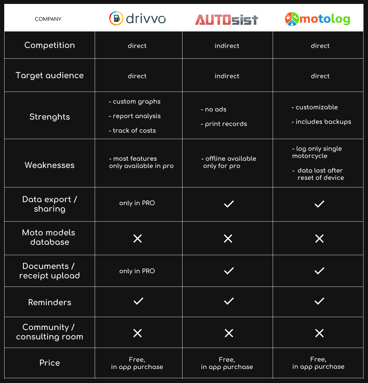
Competitive Audit
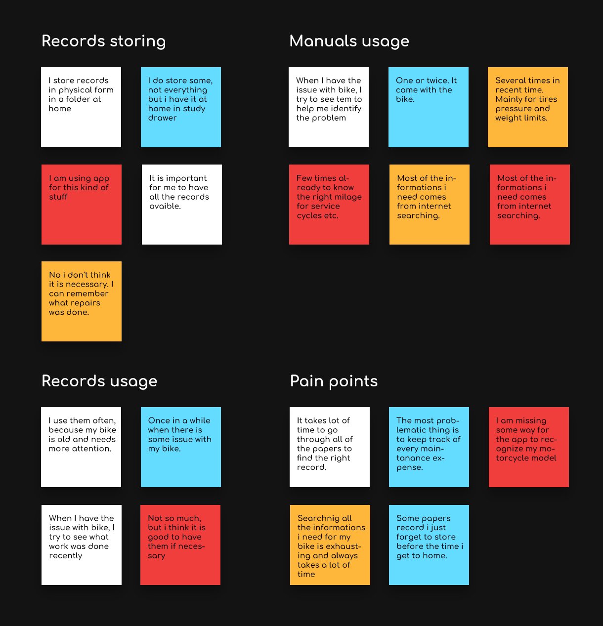
Affinity Mapping
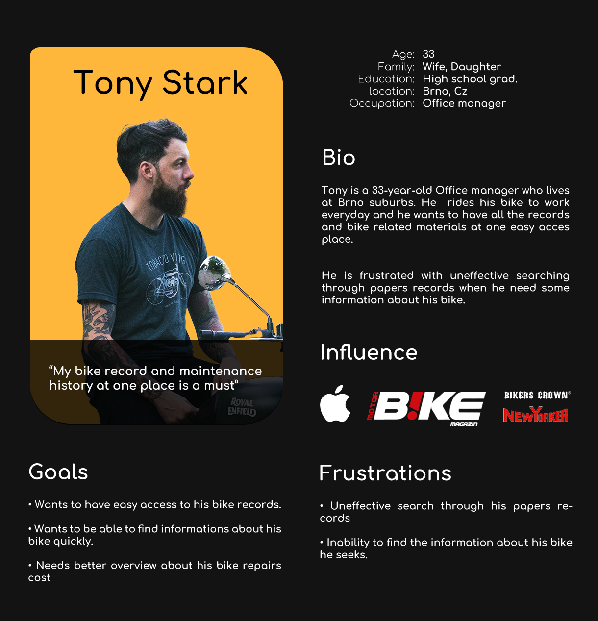
User Persona
Key Research Findings
Unification
Have all available records in one place
Fast browsing
An easy way to access and browse their data
Data overview
Simple and effective overview of thier data
UX Design
Designing the information architecture, data flow and the way a user will move through the app was a crucial step in creating the product that will be up to today’s standards and will be engaging, intuitive and easy to use for any user.
Information Architecture
User Flow
Wireframes
Through the wireframing process my primary goal was to create functional design with clear and simple navigation, to keep user flow really smooth and natural to enhance user experience.
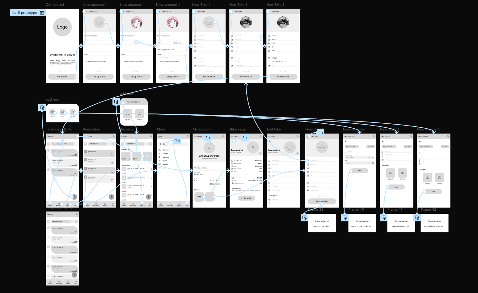
Low-fidelity Prototype
By connecting the screens was made low fidelity prototype of the product to show basic functionality and user flow. This prototype was used for the early usability testing with users.
User testing was conducted with the primary objective of evaluating the designed workflows and functionalities, identifying any errors, and assessing the user’s experience throughout the application. Additionally, the testing aimed to determine the understandability of the product’s navigation and whether it prevents cognitive overload for the user.
Usability Study Parameters
Study type
Unmoderated usability study
Location
Brno (CZ), Remote
Participants
5 participants
Length
20 – 30 minutes
Usability Study Key Findings
The study’s findings validated the functionality of the designed user workflows, while also highlighting several key areas offering potential for product enhancement.
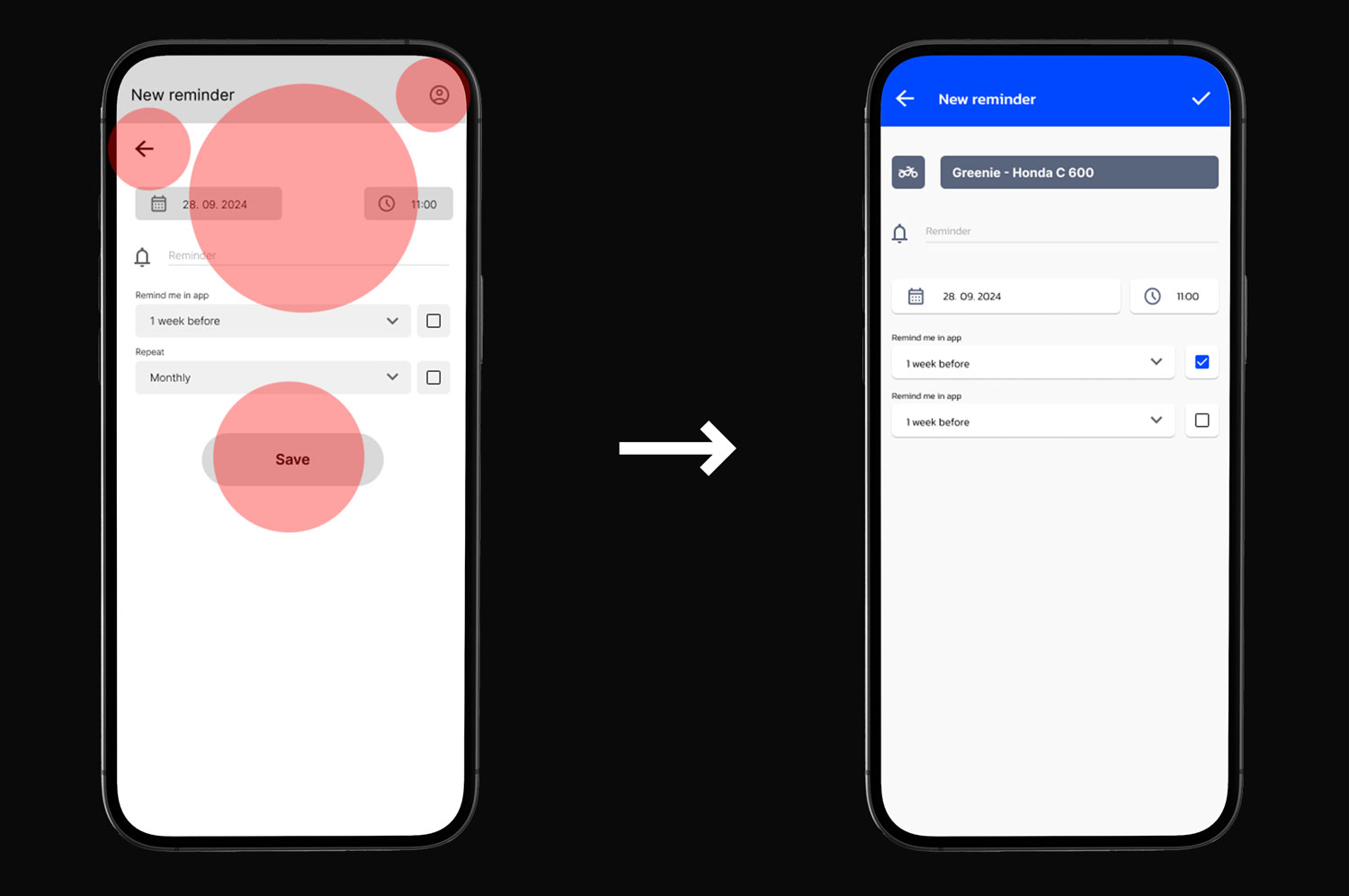
Navigation
Improvements to navigation elements and their placement
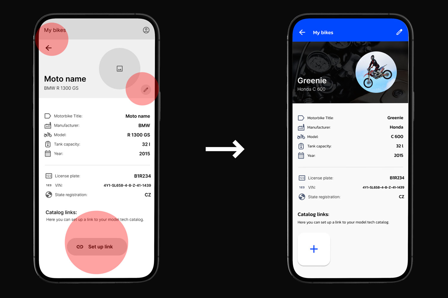
Clarity
Clarify to which motorcycle the entered data belongs.
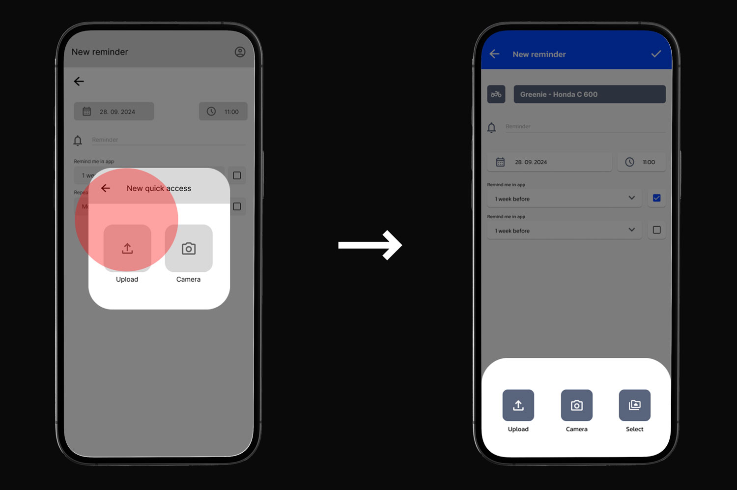
Elements
Editing the layout of elements on pages
Iterations
Based on the insights gained from the usability study, design improvements were implemented to enhance the experience with the final product.
Navigation
Placement of interactive elements have been consolidated within the navigation bar to enhance clarity and promote a more intuitive user experience.
Clarity
The comments text field has been prioritized within the document hierarchy, thereby relocating it to the primary position. The motorcycle identification reference has been strategically positioned above the note’s content, enabling users to readily identify the specific motorcycle.
Elements
Following the feedback – A feature allowing users to select a document from previously uploaded files within the application was incorporated into the design.
UI Design
When designing the visual aspect of the product, I focused on crafting a distinctive brand identity that’s both visually appealing and easy to understand. This approach aims to enhance the user experience and make the product more relatable.
During the logo creation process, priority was given to clarity, simplicity and minimalism to ensure the design effectively communicates the application’s purpose. At the same time the Visual Components sheet was developed to facilitate efficient access to all user interface elements within the project
Logo Design
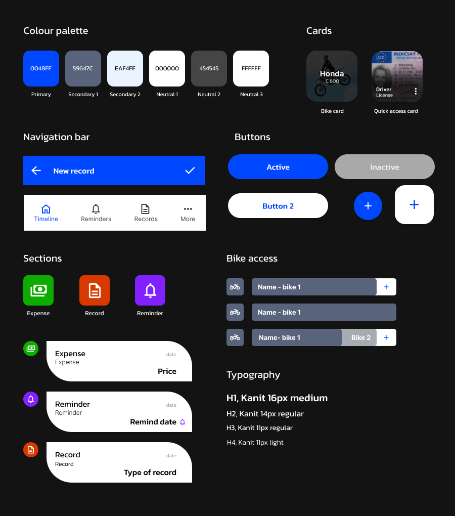
Visual Components
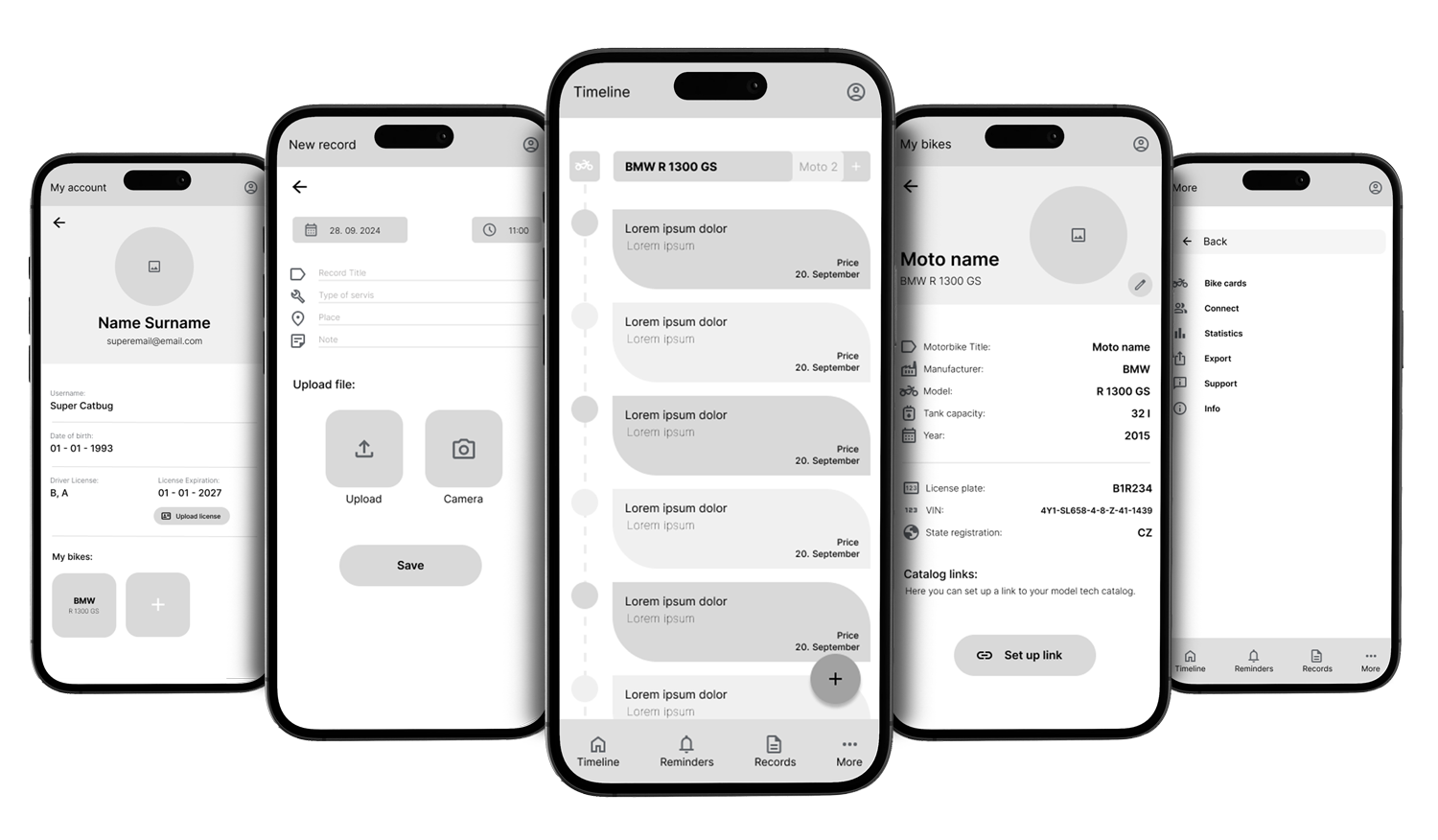
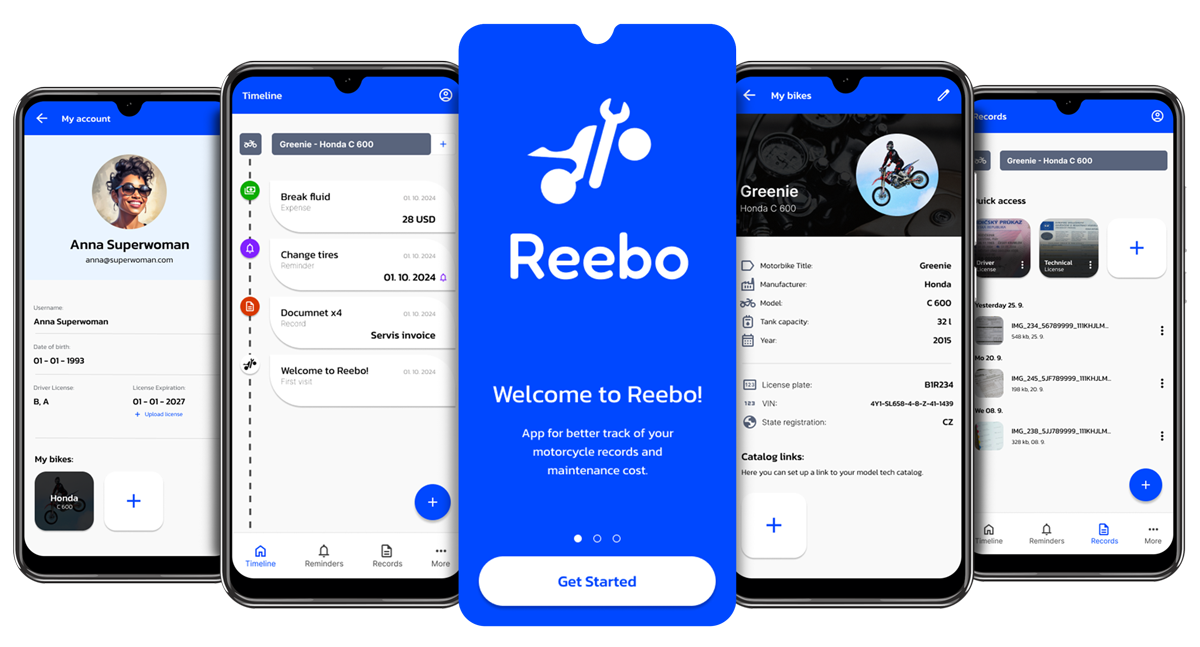
Screen Mockups
Upon completing the application of styles to the wireframes, I progressed to the creation of screen mockups, providing a more detailed visual representation of the final product.
By assembling the final visual design elements, I created a functional prototype that showcases not only the application’s main features but also its visual appeal and user experience.